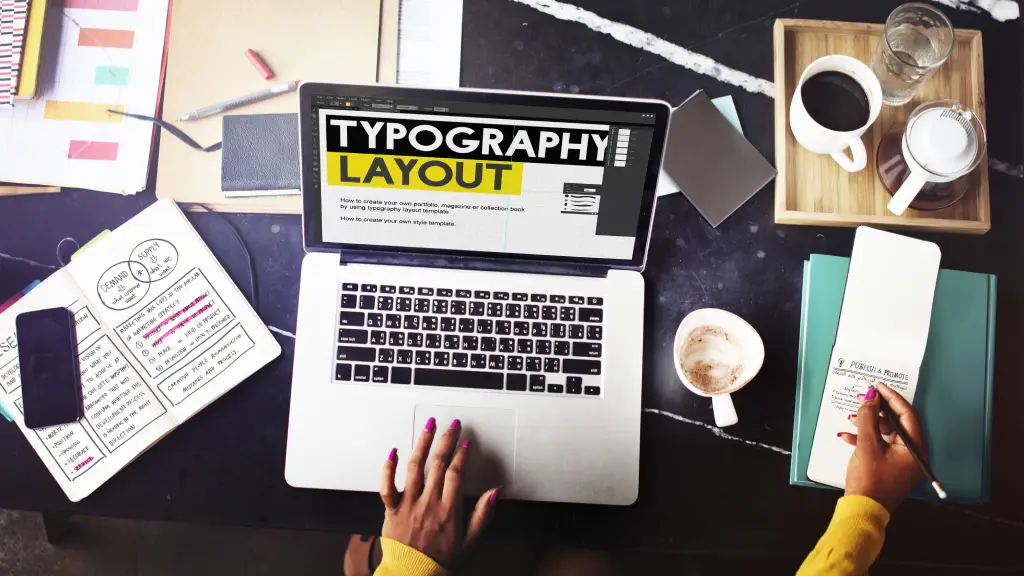
Typography has always been more than the art of arranging letters-it is the visual voice of language. Every curve, weight, and spacing decision shapes how words are perceived and felt. As design merges with technology, typography is undergoing one of its most exciting transformations yet. The rise of variable fonts, the dynamic energy of kinetic text, and the narrative potential of storytelling with type are redefining how audiences experience written communication. The future of typography is not only about legibility-it is about motion, emotion, and meaning.
The Evolution of Typography in a Digital World
For centuries, typography evolved within the constraints of print. Designers chose between fixed styles-bold, italic, condensed-and manually adjusted typesetting to achieve visual balance. The digital age loosened those constraints. Early web fonts introduced scalability and accessibility, but also brought challenges in consistency and load time. Now, with advanced technologies and responsive design principles, typography has become fluid, interactive, and alive.
As the medium expands from screens to augmented reality (AR), wearables, and motion interfaces, typography must adapt. Letters must not only be seen but felt and experienced in multidimensional contexts. This need for adaptability and expressiveness sets the stage for variable fonts and kinetic typography to take center stage.
Variable Fonts: Flexibility Meets Function
Variable fonts represent a paradigm shift in type design. Introduced as part of the OpenType 1.8 specification in 2016, this technology allows multiple variations of a typeface-such as weight, width, slant, or optical size-to exist within a single font file. Instead of loading multiple static font files (Regular, Bold, Italic, Condensed, etc.), designers can access all variations dynamically.
This innovation carries immense benefits. From a technical perspective, variable fonts reduce page load times and optimize performance, which is crucial for digital experiences where milliseconds matter. From a creative perspective, they grant designers unprecedented freedom to fine-tune expression. A headline can fluidly transition from thin to bold as a user scrolls or adapt its width to fit varying screen dimensions without losing aesthetic harmony.
Moreover, variable fonts open new opportunities for personalization and accessibility. They can automatically adjust optical size for different screen resolutions or ambient lighting conditions. For readers with visual impairments, line thickness or letter spacing can adapt in real time. Typography, once static, now becomes responsive to human needs.
Kinetic Typography: The Motion of Meaning
If variable fonts are about flexibility, kinetic typography is about expression through motion. It transforms text into a storytelling medium where words move, morph, and interact with their environment.
Motion adds an entirely new dimension to communication. The way text appears, moves, or disappears can convey tone and mood more effectively than static words ever could. For instance, a line of text that shatters on impact can symbolize conflict, while one that gently fades might evoke nostalgia. The motion becomes part of the message.
Today, kinetic typography is flourishing in social media content, video storytelling, and immersive experiences. Designers use tools like After Effects, CSS animations, and real-time rendering engines to create text that reacts to sound, gestures, or environmental cues.
The challenge lies in maintaining readability while experimenting with movement. The future of kinetic typography will depend on intelligent systems that balance motion with clarity-perhaps through AI-driven tools that optimize speed, timing, and hierarchy automatically.
Source: Shutterstock
Storytelling with Type: The Emotional Dimension
Typography is becoming a form of experiential storytelling. It invites users to participate in meaning-making rather than merely consume information. Whether through motion, responsiveness, or emotional tone, type is a living participant in the narrative journey.
The future of typographic storytelling lies in the intersection of data, interaction, and emotion. Imagine a news article where the typeface dynamically changes based on the tone of the content-serif for seriousness, sans-serif for neutrality, handwritten for empathy. Or a digital book where the text layout shifts subtly to match the emotional arc of the story.
Typography does not just display words-it tells stories. Every typeface carries a personality that influences how we feel, interpret, and remember messages. In the age of digital storytelling, type has evolved from silent background art to a central narrative device. Here are six ways typography shapes emotional storytelling in design.
1. Fonts Set the Mood Before Words Do
The moment we see text, our brain forms an emotional impression-before we even read the words. A sharp, geometric sans-serif feels modern and efficient; a soft, rounded script feels personal and warm.
Example: Think of how a thriller movie poster uses bold, condensed fonts to build tension, while a children’s book uses playful, bouncy letters to spark joy.
2. Type is a Character in the Story
Typography can act like a character, not just a costume. The right font gives a story its voice and rhythm. Designers now use evolving type systems-such as variable fonts-to let that “character” change tone as the narrative unfolds.
Example: A digital story about climate change might start with calm, light text and gradually grow bolder as urgency rises.
3. Emotions Transition Through Motion
Kinetic typography adds life to storytelling by making words move with intent. The way letters appear, stretch, fade, or collide can mirror emotional transitions in the narrative.
Example: Text that trembles can express fear; text that expands can suggest relief or freedom. Motion amplifies meaning.
4. Responsive Type for Immersive Experiences
As users move between screens-or even into AR and VR spaces-type can adapt dynamically to environment and mood. Responsive typography adjusts scale, weight, or spacing to sustain emotional coherence across experiences.
Example: In an interactive museum exhibit, typography might glow softly as visitors approach, enhancing intimacy and connection.
5. Typographic Storytelling in Branding
Emerging tools can now tailor typography to emotional tone or context. AI and variable font technologies allow letters to morph in real time based on user input, time of day, or even sentiment data.
Example: A meditation app’s typography might subtly soften at night or when users’ heart rates slow-making design feel emotionally aware.
Technology, AI, and the Next Frontier
As artificial intelligence becomes embedded in creative workflows, typography is poised to grow even more intelligent. AI-assisted tools can already suggest font pairings, generate typographic compositions, or analyze legibility under various conditions. Soon, designers may be able to train AI systems to generate custom variable fonts that align with brand psychology or user emotion data.
We may also see adaptive typography that responds to biometric feedback-heart rate, eye movement, or voice tone-altering form and rhythm in real time. Such innovations blur the line between design and human experience, making typography an interface of empathy and engagement.
At the same time, ethical considerations will play a vital role. As typography gains motion and autonomy, maintaining clarity, inclusivity, and accessibility becomes paramount. The designer’s role will evolve from crafting static aesthetics to orchestrating dynamic systems that communicate responsibly.
The Future Speaks Through Type
The future of typography is fluid, interactive, and deeply human. Variable fonts give designers control over nuance; kinetic text adds life and rhythm; storytelling with type transforms communication into emotion. Together, they push typography from a tool of readability to an instrument of experience.
As we move toward immersive realities and AI-enhanced creativity, typography will no longer merely accompany content-it will become content. Each letter, in motion or in flux, will carry personality, intent, and story. The alphabet will live again-not as printed ink or digital pixels, but as a dynamic language of movement, mood, and meaning.
Typography has always reflected its times. In the past, it echoed the press, the poster, and the page. In the future, it will echo us-our gestures, our emotions, and our digital presence. The future of typography, therefore, is not just about fonts. It is about how type continues to shape, express, and tell the evolving story of humanity itself.
Final Thoughts/Takeaways
Storytelling through type is about more than design aesthetics-it is about emotion engineering. By choosing, animating, and adapting fonts with intention, designers can turn reading into an experience. In this new era, typography is no longer silent-it speaks, feels, and evolves with its audience.
To know more about how we can help you enhance your communications, please reach out to us.