
Annual reports are no longer passive compliance documents. They are strategic communication tools used by investors, executives, analysts, and stakeholders to evaluate performance, understand direction, and make decisions. In modern corporate environments, readers do not have the time or patience to decode dense financial tables or lengthy explanations. They scan, compare, and interpret information quickly.
Charts play a critical role in making complex information accessible. When used correctly, they transform abstract numbers into clear visual narratives. They help readers identify trends, compare performance, and understand relationships without extensive interpretation.
Let’s examine five chart types that significantly improve clarity, credibility, and usability in annual reporting.
Why Charts Matter in Corporate Reporting
Unlike raw financial tables, charts provide cognitive shortcuts. They reduce interpretation effort and allow readers to see patterns immediately. This is especially important for executive audiences who must process large volumes of information efficiently.
Effective charts help organizations:
- Highlight key insights without overwhelming the reader
- Improve transparency and perceived credibility
- Support faster decision-making
- Reinforce professionalism and communication quality.
When charts are chosen strategically, they do more than present data. They guide comprehension and ultimate understanding.
1. Bar Charts for Clear Comparisons
Bar charts are one of the most effective tools to use when comparing discrete categories. They allow readers to immediately see differences in magnitude between regions, products, departments, or business units. Businesses are now using minimal design principles to improve readability, visual hierarchy, and information clarity.
Bar charts work best when organizations need to compare performance across categories, such as:
- Revenue by region
- Sales by product line
- Operating expenses by department
Example: Bar Chart
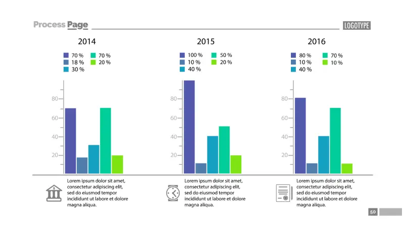
Source: Freepik
Why bar charts work:
- Length differences are easy for the human brain to interpret
- They present categorical comparisons clearly
- They support quick scanning
Best practices include:
- Keeping category labels short and clear
- Avoiding overcrowding with too many categories
- Maintaining consistent measurement scales
Bar charts reduce ambiguity and make comparative performance obvious
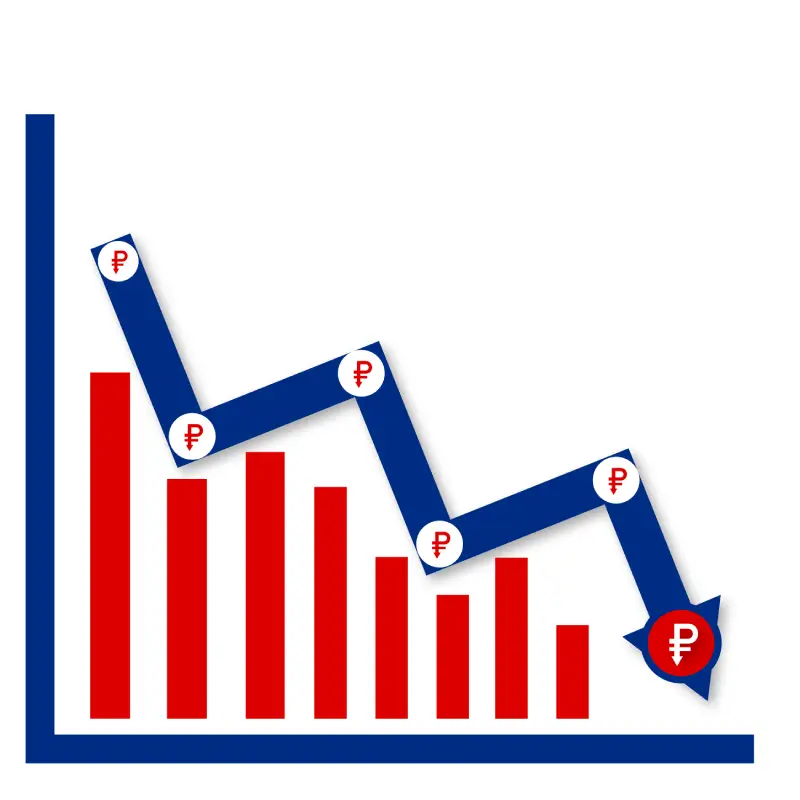
2. Line Charts for Trend Analysis
Line charts are essential for showing change over time. They help readers understand direction, consistency, volatility, and growth patterns.
This makes them ideal for visualizing:
- Revenue growth over multiple years
- Profit trends
- Customer acquisition over time
Example: Line Chart
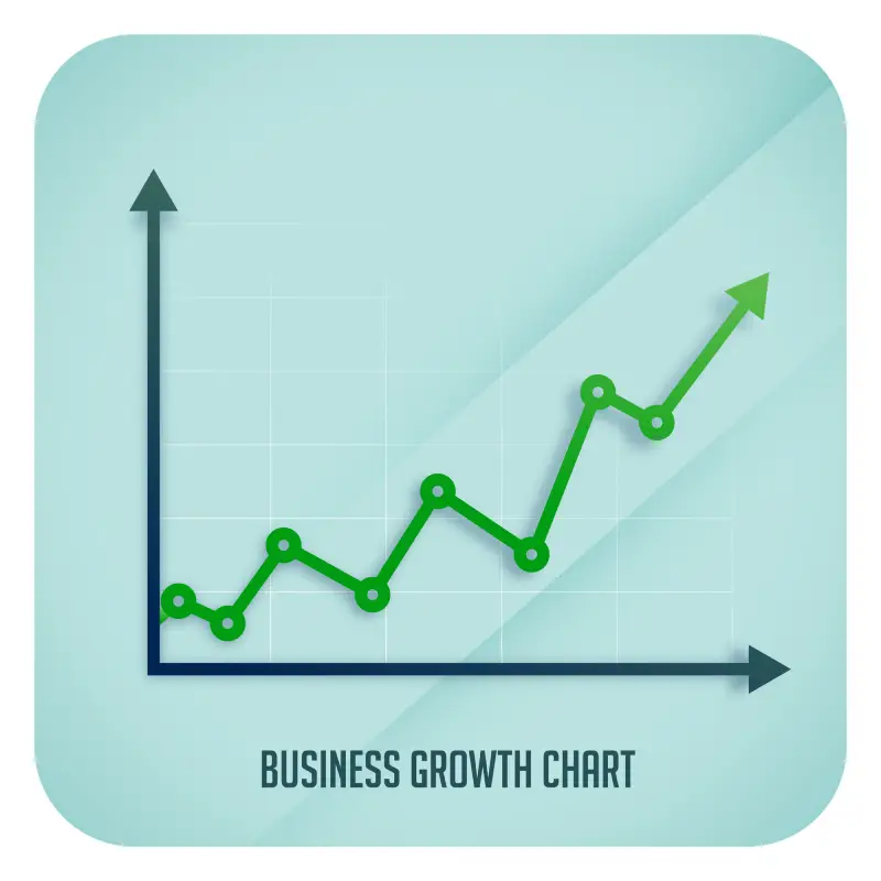
Source: Freepik
Why line charts work:
- They reveal patterns and trajectories
- They show continuity clearly
- They highlight inflection points
Best practices include:
- Using consistent time intervals
- Labeling axes clearly
- Avoiding unnecessary visual clutter
Line charts help stakeholders quickly assess whether performance is improving, stable, or declining. At Inkorporated, we don’t ask the reader to interpret the chart. We tell them what matters, then prove it. See some of our best works for inspiration.
3. Pie Charts for Composition Understanding
Pie charts help readers understand proportional relationships. They show how individual components contribute to a whole.
They are most useful for presenting:
- Revenue share by product
- Market segmentation
- Expense distribution
Example: Pie Chart
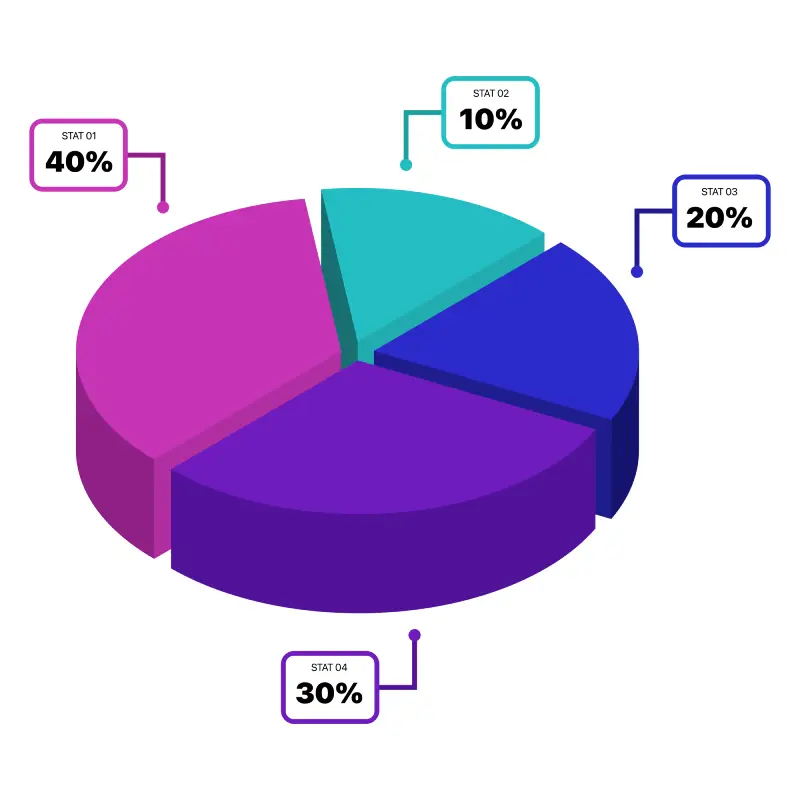
Source: Freepik
Why pie charts work:
- They simplify proportional relationships
- They communicate relative size clearly
- They help readers understand composition quickly
Best practices include:
- Limiting the number of segments
- Avoiding very small slices
- Using clear labels
Pie charts provide immediate context for proportional contributions.
4. Stacked Bar Charts for Combined Insights
Stacked bar charts combine comparison and composition. They allow readers to see total values and component breakdowns simultaneously.
They work well for showing:
- Total revenue with segment contributions
- Expense structure over time
- Profit and cost relationships
Example: Stacked Bar Chart
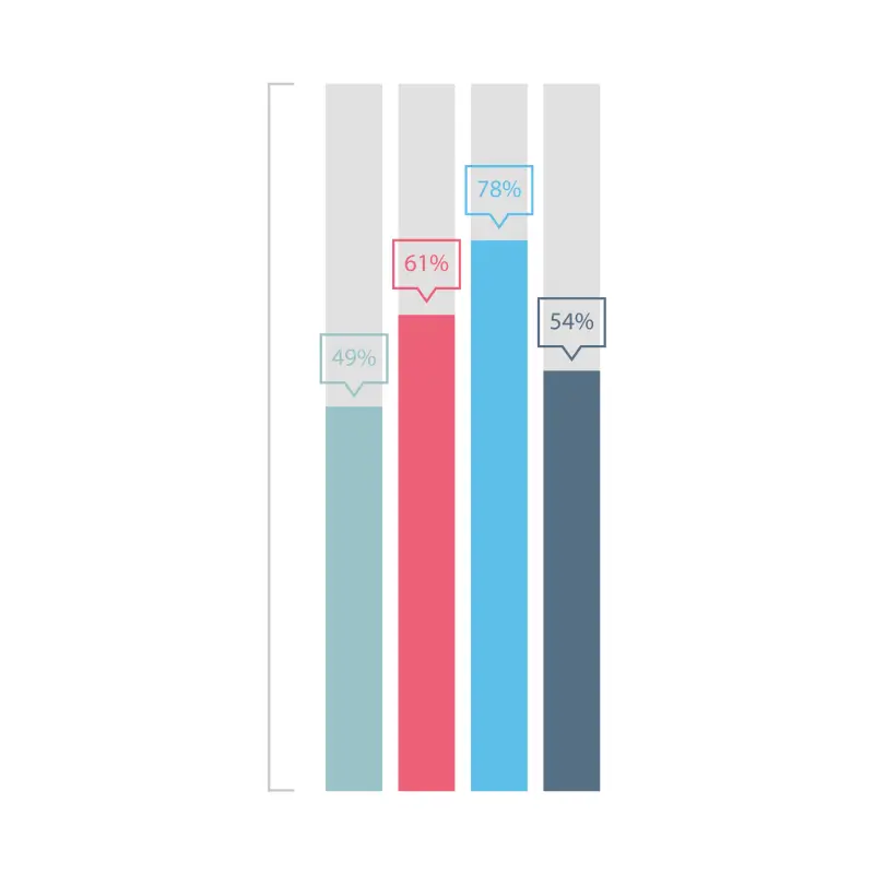
Source: Freepik
Why stacked bar charts work:
- They show both totals and components
- They support comparative analysis
- They improve structural understanding
Best practices include:
- Maintaining consistent segment ordering
- Avoiding too many segments
- Labeling totals and components clearly
Stacked bar charts help readers understand structure without requiring multiple visuals.
5. Waterfall Charts for Explaining Change
Waterfall charts explain how an initial value transitions into a final result. They break down the impact of contributing factors.
They are useful for illustrating:
- Net income calculations
- Profit bridges
- Budget changes
Example: Waterfall Chart
Source: Freepik
Why waterfall charts work:
- They show cause-and-effect relationships
- They improve transparency
- They clarify financial transitions
Best practices include:
- Labeling positive and negative changes clearly
- Maintaining logical sequencing
- Focusing on meaningful contributors
Waterfall charts make financial logic easier to follow.
How Organizations Can Apply These Charts Effectively
Adopting better charts does not require redesigning entire reports. Small improvements can significantly improve clarity.
Start by asking:
- Does this chart clarify an important insight?
- Is it easy to interpret without explanation?
- Does it support decision-making?
Focus on clarity, consistency, and relevance.
Final Takeaway
Clear charts improve comprehension, credibility, and usability. They transform annual reports from dense documents into effective communication tools. Organizations that use the right chart types help readers understand performance faster, build stakeholder confidence, and reinforce professionalism.
Bar charts, line charts, pie charts, stacked bar charts, and waterfall charts each serve distinct purposes. When used appropriately, they make financial information more accessible, transparent, and actionable. Strong visualization is not decorative. It is functional. It ensures that readers understand what matters most.
Meeting modern corporate communication standards takes a coordinated approach across messaging, structure, and visual clarity. Learn more about our Design, Editorial, and Content solutions that help businesses communicate with precision.