Color is one of the most powerful tools available to graphic designers. Before a viewer reads a headline or interprets a visual, they experience color first. This initial perception shapes credibility, tone, and emotional response instantly.
In modern communication environments, color choices influence comprehension, decision-making, and brand perception. Designers use color intentionally to guide attention, establish hierarchy, and reinforce messaging. Understanding color psychology transforms design from decoration into strategic communication. When applied correctly, color strengthens clarity, memory retention, and audience engagement.
As visual communication becomes increasingly digital and fast-paced, color plays an even greater role in capturing attention and supporting clarity. Effective color choices help audiences process information faster, remember messages longer, and build stronger associations with brands and ideas.
Understanding Color Psychology in Graphic Design
Color psychology examines how different hues influence perception and behavior. Designers apply these principles to ensure visual tone aligns with communication goals. Different colors evoke specific emotional and cognitive responses, which designers use strategically to align visuals with communication goals.
Emotional Associations of Common Colors
Designers rely on established psychological associations when selecting color palettes. While interpretation can vary by culture and context, some general patterns remain consistent.
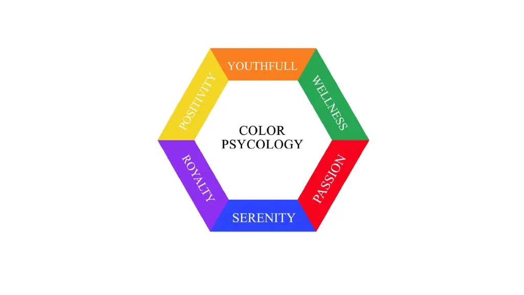
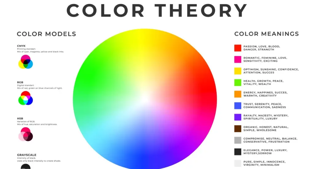
- Blue – trust, stability, professionalism
- Red – urgency, passion, energy
- Green – growth, balance, sustainability
- Yellow – optimism, warmth, creativity
- Black – authority, sophistication, elegance
Source: Shutterstock
These associations help designers align visual tone with intended messaging, ensuring the design communicates effectively without relying solely on text.
Why emotional alignment matters
Emotional alignment strengthens communication efficiency. When color supports the intended message, viewers understand meaning faster and with greater clarity. When color contradicts the message, confusion and distrust may result.
For example:
- A financial report using blue appears more credible and stable.
- A warning graphic using red communicates urgency.
- A sustainability infographic using green reinforces environmental themes.
Color psychology ensures visual tone and message intent meld, not clash.
Color as a Tool for Visual Hierarchy and Clarity
Color functions as a structural element in layout design. It directs viewer attention and separates content logically.
Using Color to Guide Attention
- Highlight key headings with stronger tones
- Use accent colors for insights or data points
- Maintain contrast for readability
- Limit palette size to avoid visual clutter
Improving readability and comprehension
Color also improves readability when applied correctly. High contrast between text and background ensures content is easy to read across devices and formats.
Best practices include:
- Dark text on light backgrounds for long reading sections
- Limited use of bright colors for large text blocks
- Consistent color coding across related elements
- Avoiding excessive color variation that creates visual noise
Clear color hierarchy helps viewers navigate complex designs without confusion.
Role of Color in Brand Identity and Recognition
Color is central to brand identity. Consistent color usage strengthens brand recall and reinforces personality. A structured color system improves scalability across materials.
How color strengthens brand recognition
Brand colors create instant visual association. When used consistently across materials, they help audiences recognize the brand without reading text.
Examples of how color supports recognition:
- Consistent logo color across all platforms
- Standardized color palettes in marketing materials
- Uniform use of color in presentations and reports
- Matching digital and print color systems
This consistency builds familiarity and credibility over time.
Communicating brand personality through color
Color communicates personality traits without explanation. Designers select colors based on brand positioning and audience expectations.
For example:
- Technology brands use blue to convey reliability
- Creative brands use bold colors to express innovation
- Luxury brands use black or gold to signal exclusivity
- Healthcare brands use green or blue to suggest safety
Strategic color choices reinforce brand positioning visually.

Source: Shutterstock
Psychological Impact of Color in Digital and User Interface Design
In digital environments, color influences usability, engagement, and user behavior. Interface color choices affect how users interact with websites, apps, and dashboards. Neutral tones indicate balance.
Enhancing usability and navigation
Color helps users navigate interfaces efficiently.
Examples include:
- Highlighting clickable elements
- Differentiating active and inactive states
- Showing progress or status indicators
- Organizing menus and navigation areas
These cues improve usability and reduce confusion.
These practices reduce cognitive load and improve data comprehension.
Supporting user experience and engagement
Color also shapes emotional response to digital experiences.
Designers use color to:
- Create welcoming and approachable interfaces
- Reduce visual fatigue with balanced palettes
- Reinforce brand identity across digital platforms
- Maintain consistency across screens and interactions
Positive color experiences improve engagement and retention.
Common Mistakes in Using Color Psychology
Improper color use weakens design effectiveness. Avoiding common mistakes ensures color supports communication rather than distracting from it.
Frequent mistakes include:
- Using too many colors without hierarchy
- Ignoring contrast and readability
- Choosing colors based on preference rather than strategy
- Inconsistent color usage across materials
- Overusing bright or saturated colors
Avoiding these mistakes improves clarity and professionalism.
Final Takeaway
Color psychology is a foundational component of professional graphic design services. It influences perception, strengthens brand identity, improves clarity, and enhances user engagement. Designers who apply color strategically create visuals that are both persuasive and structurally effective.
As graphic design continues to play a central role in business communication, marketing, and digital interaction, understanding color psychology becomes essential. Designers who use color intentionally create visuals that are clearer, more memorable, and more persuasive. Organizations that apply color psychology effectively communicate more professionally, build stronger trust, and achieve greater impact through design.
Color, when used strategically, transforms design from decoration into communication
Meeting modern corporate communication standards takes a coordinated approach across messaging, structure, and visual clarity. Learn more about our Design, Editorial, and Content solutions that help businesses communicate with precision.