Corporate brochures and infographics are no longer passive marketing materials. In 2026, they function as decision-support tools: used in boardrooms, investor meetings, client pitches, and internal strategy discussions. The way information is designed now directly influences how credible, prepared, and trustworthy an organization appears.
For US businesses, this shift is especially important. Stakeholders are reading less, scanning more, and making faster judgments. Dense layouts, generic visuals, and cluttered charts simply don’t work anymore. The brochures and infographics that stand out today aren’t the most decorative, they’re the clearest, most intentional, and easiest to understand.
Let’s take a closer look at the key design trends shaping corporate brochures and infographics in 2026, and why they matter more than ever.
Why Design Trends Matter for Corporate Communication
Unlike consumer marketing assets, corporate brochures and infographics carry higher stakes. They’re often used to explain complex ideas to audiences who expect clarity and precision: financial performance, research findings, operational models, or strategic direction.
In 2026, corporate audiences expect materials that: 1) look professional and structured; 2) prioritize clarity over creativity-for-creativity’s sake; 3) present data responsibly and transparently; and 4) work seamlessly across print and digital formats.
Meeting modern corporate communication standards takes a coordinated approach across messaging, structure, and visual clarity. Learn more about our Design, Editorial, and Content solutions that help businesses communicate with precision.
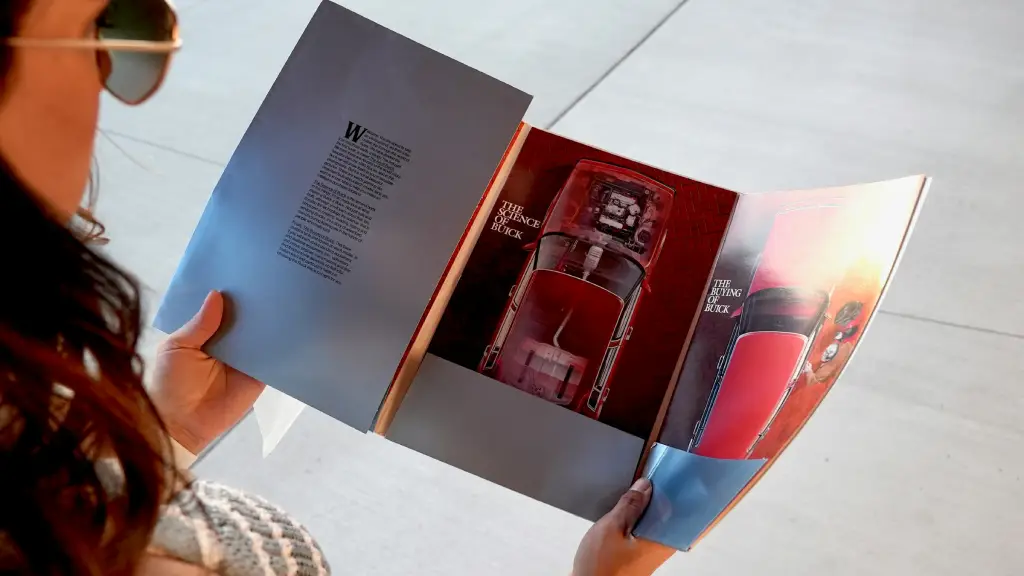
1. Purpose-Led Minimalism for Dense Information
Minimalism continues to dominate corporate brochure design and infographic design trends in 2026, but it’s more strategic than aesthetic. Instead of empty white space or stripped-back layouts, businesses are using minimal design principles to improve readability, visual hierarchy, and information clarity.
Corporate brochures and infographics are using minimalism to direct attention. This shows up as:
- Cleaner layouts with strong visual hierarchy
- Fewer elements per page, each serving a clear role
- Generous spacing that improves readability
- Clear separation between insights, context, and detail
Why it works:
Executives and stakeholders don’t want to decode complex layouts. Clean, intentional brochure and infographic design builds confidence quickly and reinforces brand credibility.
Source: Unsplash
2. Data-First Layouts That Lead With Insight
In 2026, business infographics are no longer about displaying all the data, they’re about highlighting the right data. Data-first design means structuring layouts around insights, not visuals. The focus shifts from decorative charts to strategic data visualization that supports decision-making.
Corporate designs are increasingly data-first, meaning the layout is built around the insight, not the chart. Common characteristics include:
- Clear, takeaway-driven headlines
- One core insight per visual
- Charts designed to support the message, not compete with it
- Consistent scales, labels, and annotations
Design shift:
Don’t ask the reader to interpret the chart. Tell them what matters, then show the evidence. See some of our best works for inspiration.
3. Modular Brochure Design for Flexibility
Static, one-size-fits-all brochures are becoming less common. In 2026, corporate brochure design is increasingly modular, built around scalable design systems rather than single-use layouts. This approach supports digital-first distribution, multi-channel publishing, and faster content updates.
Corporate brochures are now designed as flexible sections that can be rearranged, reused, or adapted for different audiences. This approach includes:
- Section-based layouts with consistent templates
- Reusable infographic components
- Clear visual systems that scale across pages
- Easy adaptation for print, PDF, and presentation formats
Why corporates care:
Modular systems save time, reduce production errors, and make corporate communication more agile.
4. Strong Typography as a Structural Tool
Typography in 2026 is no longer just a branding choice, it’s a structural device in corporate communication design. In data-heavy brochures and infographics, typography shapes how readers scan, interpret, and prioritize information. Clear typographic hierarchy has become essential for readability and accessibility.
In corporate brochures and infographics, typography now plays a structural role. Key shifts include:
- Bolder headlines that clearly state insights
- Simple, highly readable body text
- Consistent type hierarchies across documents
- Careful use of emphasis to guide scanning
Design reality:
If the hierarchy isn’t clear, the message won’t be either.
5. Subtle Motion for Digital-First Infographics
As more corporate content moves online, interactive infographics and motion-enhanced layouts are becoming standard across digital brochure design trends. In 2026, motion graphics in corporate communication aren’t flashy, they’re functional. They support storytelling, guide attention, and improve user engagement without distracting from the message.
Motion in infographics is being used sparingly, but strategically. Examples include:
- Animated data reveals
- Step-by-step visual explanations
- Light transitions that guide attention
- Micro-animations in interactive PDFs or dashboards
Best practice:
Use motion to clarify progression or change, not to decorate.
How Corporates Can Apply These Trends Without Overcomplicating Design
Adopting corporate brochure and infographic design trends in 2026 doesn’t mean redesigning everything overnight. The most effective approach to modern corporate communication is selective, structured, and aligned with business goals. Trends should enhance clarity, brand consistency, and usability, not introduce unnecessary complexity.
Start by asking:
- Does this design choice improve clarity?
- Does it help the reader understand or decide faster?
- Does it align with our brand and audience expectations?
- Trends should support communication, not distract from it.
Final Takeaway
In 2026, corporate brochures and infographics are no longer just supporting materials. They’re strategic communication tools that influence understanding, trust, and decision-making.
The organizations that succeed will be the ones that: 1) design for clarity, not decoration; 2) lead with insight, not information overload; 3) build consistent, scalable visual systems; and 4) treat accessibility and structure as fundamentals. Design trends will continue to evolve, but clarity, credibility, and relevance will always matter.
If you’re looking to modernize your corporate brochures or infographics without losing rigor or professionalism, we are here to help you.